The backdrop of the upcoming presidential elections in the United States has enabled the American electorate to hear the candidates' opinions on the issues, one of them being energy policy. Both Republicans and Democrats agree that energy independence is important. Such independence would protect the United States from the risk of energy supplies from abroad encountering disruptions.
The concensus on building a more energy independent country has been around for years, transcending entire administrations and congresses. Contrary to expectation, however, is that petroleum imports are much higher today than they were 40 years ago. Of all petroleum products consumed in this country, 60% of them come from abroad, compared to 40 years ago when roughly 38% of petroleum products came from foreign suppliers.
This graphic from Slate Magazine illustrates the growing trend of importing oil products since 1973, along with the goals of three different presidents to develop greater energy self reliance. Ultimately what it depicts is the failure in the present day to meet any of these goals. Any conversation between the presidential candidates on energy independence might be unlikely to see significant followup action.
Asian Americans and Identity
Between Asian groups, however, there is some variation in the ways individuals identify. About three quarters of both the Vietnamese and Korean populations identify with their country of origin. Indian, Chinese, and Japanese Americans exhibit the smallest percentage of individuals who identify with their country of origin (six in ten).
Another way to look at the data is by distinguishing the foreign born population of Asian Americans from the native born population of Asian Americans. Among the foreign born, seven in ten identify with their country of origin, while only four in ten in the native born population will do the same. Conversely, a mere 9% of foreign born Asians describe themselves as American, but 28% of the native born call themselves as American.
U.S. Naturalization
The nations that naturalized the most citizens were the United States, Russia, and Canada. With a figure of 6.6 million, the United States naturalized the most citizens from 2001-2010. Russia comes in second, with about half as many naturalizations at 3.1 million people, while Canada follows with just under 2 million naturalized citizens in just as many years. Other countries with more than a million naturalized immigrants are Britain, France, and Germany.
However, the countries that naturalized the most immigrants are not necessarily the ones whose populations have the greatest proportion of foreign born people. For example, while the United States conferred citizenship on 6.6 million individuals in the past decade, immigrants only account for 13% of its total population. On the other hand, Australia and Switzerland naturalized 1 million and about 0.4 million people, but both their foreign born populations constitute 27% of the total population, the most of any countries depicted in the graphic. Countries with other high proportions of foreign born people are New Zealand (23%), Canada (20%), Spain (15%), and Sweden (15%).
Richy Rich: Income Inequality Infographics
Over the past year we have heard the media frequently use the term "99%." It's a figure that Occupy Wall Street has been quick to employ to find common ground with the masses. It's also a phrase that pundits have used to comment on the platforms of this year's presidential candidates. But The Atlantic features a new way of looking at the 99% / 1% divide, by depicting incomes along a stacked bar chart that resembles the world's tallest building, the Burj Khalifa in Dubai.
The interesting chart comes from Scott Winship and is published on the Brookings Institution's website in an article about inequality within the top 1%. The differences are striking. If we take the poorest person in the top 1% of US incomes and put him on the 160th floor, then we would find the poorest person in the top 10% living on the 35th floor. Or, to put it another way, the disparity in earnings for these two individuals can be represented as a difference in 125 stories. On the other hand, consider the median household income. The poorest person in the top 50% of earners is separated from the poorest person in the top 10% by a mere 22 floors. The top one hundredth of incomes is separated from the poorest of the top 1% by 150 floors. By contrast, the difference between the poorest individuals in the top 1% and those in the 2% is 67 floors
Data in Review: The Price of Movie Tickets
Why do all movie tickets cost the same? Movie tickets don't fluctuate in price according to supply and demand. Blockbuster sellouts and movie flops all sell for the same price. To explain this occurence, an article from The Atlantic briefly explains the history of movie prices, demonstrating that during the first half of the twentieth century, movie tickets used to cost different amounts depending on their actors and popularity. Since this time, the system gradually shifted so that ticket prices from the 1970s onwards have been generally uniform across movies.
The line graph depicts how theater attendance fluctuates through the year. Christmas is shown as the high point of the year in terms of ticket sales, while the time periods directly following Easter and Labor Day see relatively low ticket sales.
The chart does have a few shortcomings, however. The article fails to tell us the data's source. We do not know whether the graph is plotting the data from a single theater, or from an aggregate of theaters of over the course of a year. We also don't know when the data were collected. The article doesn't communicate what year or years the data come from, and there is no caption or title to further explain these details. It is also unclear what the unit of measurement is. Does 12% average weekly attendance convey the proportion of seats that are filled in a theater? Does 4% attendance during a given week represent how much that this specific week accounts for in the year's attendance?
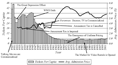
Though displaying several trends on one set of axes, the second graph is significantly clearer. The graph shows tickets per capita and the average price of a ticket from 1929 through 2001. Unlike the first graph, the axes are well labeled and they clarify the unit of measure. Although the bar chart and trend graph are superimposed on each other, they utilize the better part of the chart area. Unfortunately, the chart does not include the source of the data or a title, both of which would further clarify the the meaning of the information being represented. It would also be useful to articulate whether admissions prices are adjusted for inflation, a factor that is necessary to take into account when looking at such a large time span.
The line graph depicts how theater attendance fluctuates through the year. Christmas is shown as the high point of the year in terms of ticket sales, while the time periods directly following Easter and Labor Day see relatively low ticket sales.
The chart does have a few shortcomings, however. The article fails to tell us the data's source. We do not know whether the graph is plotting the data from a single theater, or from an aggregate of theaters of over the course of a year. We also don't know when the data were collected. The article doesn't communicate what year or years the data come from, and there is no caption or title to further explain these details. It is also unclear what the unit of measurement is. Does 12% average weekly attendance convey the proportion of seats that are filled in a theater? Does 4% attendance during a given week represent how much that this specific week accounts for in the year's attendance?
Though displaying several trends on one set of axes, the second graph is significantly clearer. The graph shows tickets per capita and the average price of a ticket from 1929 through 2001. Unlike the first graph, the axes are well labeled and they clarify the unit of measure. Although the bar chart and trend graph are superimposed on each other, they utilize the better part of the chart area. Unfortunately, the chart does not include the source of the data or a title, both of which would further clarify the the meaning of the information being represented. It would also be useful to articulate whether admissions prices are adjusted for inflation, a factor that is necessary to take into account when looking at such a large time span.
Trends in Education
The New York Times reports on how students in New York's schools have performed based on data from the National Assessment of Educational Progress, which is often referred to as the nation's report card. According to the article, the math scores as reported by the city's schools dropped slightly over the two-year period.
Fourth grade math score average dropped by three points, from 237 to 234, while eighth grade scores averaged at 272, one point lower than in 2009. The fourth grade reading score average remained the same as that in 2009, while the eighth grade average increased by two points to 254.
This trend, however, does not conform to the nationwide trend showing that test scores for both fourth and eighth graders are either the same or higher this year than ever before. Nationally, fourth grade scores in both reading and math increased by one point. While eighth grade reading scores stayed the same, the math average is higher by one point. However, experts advise that the slight drop in the test scores of New York students is not large enough to be significant. The national trends are shown in the four line graphs below.
One important fact to note is that New York City's achievement gap between black and white students is shrinking. While black students scored 29 points lower than white students on reading tests in 2002, in 2011 they scored 26 points lower. Black students also scored an average of 25 points lower on fourth grade math tests in 2003, compared with 22 points lower in 2011.
Fourth grade math score average dropped by three points, from 237 to 234, while eighth grade scores averaged at 272, one point lower than in 2009. The fourth grade reading score average remained the same as that in 2009, while the eighth grade average increased by two points to 254.
This trend, however, does not conform to the nationwide trend showing that test scores for both fourth and eighth graders are either the same or higher this year than ever before. Nationally, fourth grade scores in both reading and math increased by one point. While eighth grade reading scores stayed the same, the math average is higher by one point. However, experts advise that the slight drop in the test scores of New York students is not large enough to be significant. The national trends are shown in the four line graphs below.
One important fact to note is that New York City's achievement gap between black and white students is shrinking. While black students scored 29 points lower than white students on reading tests in 2002, in 2011 they scored 26 points lower. Black students also scored an average of 25 points lower on fourth grade math tests in 2003, compared with 22 points lower in 2011.


