Unemployment will drop to 7.8% by 2013

In 2006, we developed three individual empirical relationships between the rate of unemployment, u(t), price inflation, p(t), and the change rate of labour force, LF(t), in the United States. We also built a general relationship balancing all three variables simultaneously. Since measurement (including definition) errors in all three variables are independent it may so happen that they cancel each other (destructive interference) and the general relationship might have better statistical properties than the individual ones.   For the USA, the best fit model for annual estimates is a follows: 
u(t) = p(t-2) + 2.5dLF(t-5)/dtLF(t-5) + 0.0585       (1) 
where inflation (CPI) leads unemployment by 2 years and the change in labor force by 5 years.  We have already posted on the performance of this model several times.  
Here a model with monthly estimates of CPI, u, and labor force is presented. The time lags are the same as in (1) but coefficients are different since we use month to month a year ago rates of growth. We have also allowed for changing inflation coefficient. The best fit models for the period after 1978 are as follows: 
u(t) = 0.63p(t-2) + 2.0dLF(t-5)/dtLF(t-5) + 0.07;  between 1978 and 2003
u(t) = 0.90p(t-2) + 4.0dLF(t-5)/dtLF(t-5) + 0.30; after 2003
There is a structural break in 2003 which is needed to fit the predictions and observations in Figure 1. Due to strong fluctuations in monthly estimates of labor force and CPI we smoothed the predicted curve with MA(24). The rate of unemployment became more sensitive to the change of inflation and labor force. Alternatively, definitions of all three (or two) variables were revised around 2003, which is the year when new population controls were introduced by the BLS.  
All in all, the monthly model predicts the observed rate of unemployment which has recently dropped to 8.3%. We expect the rate to fall further to the level of 7.8% by the end of 2012.  
Figure 1. Observed and predicted rate of unemployment in the USA.

Week 83 Flying

I took these on Friday and believe me, it is harder than you think to fly a plane in light turbulence and take pictures at the same time.  Thankfully, the photos turned out pretty good this time.


Strategy for Unpredictable Times

Virgil Carter

A traditional approach for organizational strategy is based on the view that with sufficient analysis, organizations can make reasonable assumptions about their markets, financial and human resources, technology and customer services, and be successful.  Any unforeseen elements can be addressed through strategy adjustments every few years.  Said differently, strategy for many organizations may be based on internal decisions about what the external world looks like.

But what if the future is unpredictable?  What if an organization’s internal views and preferences just don’t align with the external environment in which the organization finds itself?

Author Lowell L. Bryan, in an article in a recent McKinsey Quarterly, “Just-in-time Strategy for a Turbulent World”, points out that “…globalization and technology are sweeping away the market and industry structures that have historically defined the nature of competition… (making it) impossible to predict, with any confidence, which markets a company will be serving or how its industry will be structured—even in a few years hence”.

Bryan suggests an alternative to traditional organizational strategy:  a “portfolio of initiatives” intended to achieve favorable outcomes for the entire enterprise”.  He writes “usually, these initiatives will be organized around themes focused on achieving particular aspirations, such as increasing the reach of the enterprise, entering a new but related industry, or achieving the greater efficiencies.  Portfolio effects increase the likelihood that some of these aspirations will be achieved even if many others fail”.

According to the author, a successful portfolio-of-initiatives strategy involves “creating enough initiatives offering high returns relative to the risks taken to enable a company to meet its aspirations and outperform the expectations of the markets.  The process requires the CEO and management team to “keep an open mind about where the company may be headed”.  Inherent in this approach is the understanding that “future decisions and future outcomes are likely to vary enormously from initial hypotheses”.  Bryan concludes his article by noting that “Most of the critical decisions involve subjective judgments that, unlike those generated by more deterministic strategies, will be informed by not just the highest-quality staff work but also the knowledge gained as time passes”.

Are you operating in unpredictable times?  Perhaps a portfolio-of-initiative strategy is for you!

The FRB, the BEA, and the BLS lie on inflation

Couple days ago we posted on the federal funds rate. The interest rate is defined by the Federal Reserve as a major instrument to control price inflation. Figure 1 depicts the cumulative values of effective rate, R, and the rate of consumer price inflation, CPI, multiplied by 1.4. In the long run, these two curves evolve along the same trend and intercept every fifteen to twenty years. We presumed that the main idea to keep R above the rate consumer price inflation is that a higher funds rate should suppress price inflation due to the effect expensive money.

On the other hand, the FRB has likely to retain the interest rate at the long term level of price inflation in order to create neutral conditions for money supply. This would be a wise prerequisite for a central bank. Then why the FRB needs that factor of 1.4? Actually it does not and the answer comes from the historical GDP data. The problem of the multiplier is in wrong estimates of inflation since 1950. Essentially, the FRB, the BEA, and the BLS lie.

Figure 2 depicts the evolution of real GDP per capita in the US since 1870. As we have already mentioned in our posts, there are two trends in the historical GDP data – before and after 1950. Before 1940, the (red) regression line with a slope of ~$61 per year in Figure 2 provides a good approximation of the actual curve. After 1950, the actual curve evolves along a straight line with a slope of $387 per year, i.e. the slope rises by a factor of 6.34 after 1950. Real GDP is defined as the ratio of nominal GDP and the GDP deflator. Both values are measured and estimated (also using a subjective hedonic factor) by the BEA and BLS. Therefore, the estimates of real GDP per capita heavily depend on the definition of price inflation.

Let’s suppose that the real GDP curve evolves along the old trend after 1940, as shown in Figure 2. Then the level of real GDP per capita in 2008 would have been $10,774 instead of $31,178 as estimated by. This means that the GDP deflator was underestimated by a factor of 2.89 (=31178/10774). The reported increase in the level of consumer prices since 1960 was of 7.27, i.e. CPI(2008)/CPI(1960) =7.27. Then we expect that the actual price increase (i.e. reported plus underestimated) would have been 7.27+2.89=10.16, and the rate of CPI inflation was underestimated by 10.16/7.27=1.4 times.

A big surprise! This is exactly the factor of the federal funds rate above the rate of price inflation. Hence, the FRB retains the interest rate at the level of actual inflation and thus does not influence inflation. The BEA, BLS and FRB lie (intentionally or not) about the rate of inflation and the growth in real GDP. The current level of GDP per capita in the US should be around $11000 not $31,000.

Figure 1. Cumulative values of the monthly estimates of R and the CPI multiplied by a factor of 1.4.

Figure 2. Historical estimates of real GDP per capita.

PPI of durable and nondurable goods

Three years ago we presented the difference between the PPI of durable and nondurable goods and stated that one could predict its evolution at a several year horizon. This difference is characterized by the presence of sustainable mid-term trends.  Obviously, the future of both indices is of crucial importance for industries behind relevant goods, for the stock market, and for real economy. Our analysis provides a long-term prediction. Its reliability depends on the growth in real GDP in the near future.

The evolution of the producer price index of durable and  nondurable goods is reported by the BLS at a monthly rate. In 2009, we presented Figure 1 which demonstrates that the difference has two distinct quasi-linear and both positive branches: between 1988 and 2000 (June), and from 2001 to 2008 (January). Red and blue lines highlight segments between 1988 and 2000, and from 2001 to 2008, respectively. Corresponding linear regression lines in Figure 1 have slopes of +0.05 and -6.8. The former slope is a negligible one, and the latter indicates that the index for nondurables has been growing since 2001 by 6.8 units if index faster than that for durables. In January 2008, the difference reached the level of -40, descending along the trend. Then the difference dropped to -67 in June and recovered to -20 by the end of 2008. This effect has been observed for all other commodities and is related to the financial crisis and recession.
Our naïve assumption about the next move after 2009 was that the difference would develop a new positive trend which would repeat the trend observed between 2001 and 2008, but with an opposite sign. The green line in Figure 1 predicts the expected evolution of the difference after 2009. Because the green line has a positive slope, the index for durables will be catching up that for nondurables since 2009. According to our assumption, the rate of approaching to the index for nondurable goods will be +6.8 units of index per year during the next 7 years. We also suggested that the actual trend might be different but almost inevitably with a positive slope. 
Here, we revisit this prediction. Figure 2 displays the evolution of the difference between 2009 and 2012 which is characterized by a very high level of volatility. The local peak in 2009 was followed by a sharp drop in the difference to the level of -59 in April 2011 and a relatively slow increase since then. We have introduced a new tentative trend for the difference which is less steep than in Figure 1. We expect the difference to reach -10 by 2020.  In any case the index of durables has to grow at a higher rate than the index of nondurables in the 2010s with possible (large-amplitude) fluctuations around the trend. We are going to revisit this difference in 2013.

Figure 1. Evolution of the difference between the PPI of durables and nondurables between 1985 and 2009. Red and blue lines highlight segments between 1988 and 2000, and from 2001 to 2008, respectively. Green line predicts the evolution of the difference after 2008, as a mirror reflection of the linear trend between 2001 and 2008.

Figure 2. Evolution of the difference between the PPI of durables and nondurables between 1990 and 2012. Red line highlights the segment from 2001 to 2008y. Green line predicts the evolution of the difference after 2009 which is less steep than in Figure 1.  

Play Dough for Liana

 I had some expired flour which I misplaced and forgotten about. Idea came through to make play dough to give Liana some excitement in the weekend. Indeed it was an exciting activities for the whole family with the two brothers and daddy joining the moulding activities to show their creativity.

 Liana and us had a lot of laugh every time something created especially the ones made by daddy.... (kind of hard to guess and Liana burst to laughter once she was told what that was!). Liana can guess 90% correctly what was created and the 10% mostly the ones from daddy..... Guess what daddy came up with..... one of them was i-pad (Liana's favourite toy)! Her eyes were wide opened and blinked a lot as she cannot guess but burst to excitement to know it was her favourite thing... LOL.

She also requested a lot of things and gave a challenge to the brothers to create for her.... dinosaur, monkey, snake, crocodiles, fish, birthday cake (this one was her favourite and she sang birthday song repeatedly for herself & pretend to blow the candles), buttons, apple, orange, elephants, flowers, many more.

some of the things created by the family.....
 Come and make play dough and give a lot of fun to your small kids whilst develop their creativity at the same time!

By: Roz@HomeKreation
INGREDIENTS:
1 cup Flour
1/4 cup Salt
1 tsp Oil
Hot Water

METHOD:
1. Mix in water slowly into the rest of ingredients until just enough to form a dough.
Knead until smooth dough is formed.
2. Colour as you like & knead to mix well.
3. Have fun!
*************************

BAHASA MALAYSIA VERSION
Seronok nya Liana first time bermain dgn play doh, tambahan pula kesemua ahli keluarga bermain bersama2 & gelak-ketawa setiap kali sesuatu di hasilkan mengikut kretiviti masing2.

Kalau ada tepung yg dah expired tu jangan di buang. Meh buat play doh untuk anak2 kecil anda.Pasti mereka akan riang gembira dapat bermain bersama2 anda.

BAHAN2:
1 cwn Tepung
1/4 cwn Garam
1 st Minyak
Air Panas

CARA2:
1. Tuangkan air panas ke dalam kesemua bhn2 lain perlahan2 sambil di gaul sehingga doh terbentuk.
2. Warnakan & uli sehingga sebati.
3. Have fun!


Analysis: Chesapeake Energy Corporation's share price

First, we report on the performance of our pricing model linking share prices of energy companies with the difference between the headline and core CPI. In essence, we are trying to use the core CPI as an energy independent (dynamic) reference to the headline CPI index which includes energy. Then the difference might be related to the energy pricing power relative to other goods and services.  This idea has proven to be fruitful for oil (energy) companies and other categories of companies in the S&P 500 index and other consumer price indices.  
Our original pricing model states that a share price, for example, that of Chesapeake Energy Corporation, CHK(t), can be approximated by a linear function of the difference between the core CPI, CC, and headline CPI, C 
CHK(t) = A + B (CC(t) - C(t))                      (1) 
where A and B are empirical constants; t is the elapsed time. It should be noted that both indices are fixed to be contemporary to the modeled price.  Also, both linear coefficients (slopes) are equal, which might be an oversimplification. This model has proven its predictive power for many companies and we have been reporting on its performance since 2009  
In January 2011, we extended the set of defining indices by the consumer price index of energy, E, and the producer price index of crude petroleum, OIL, together with the overall PPI. We also introduced time shifts between the price and defining CPIs and varying coeffcients.  
Here we estimate three new models for the period between July 2003 and January 2012. The relevant estimates of CPI and PPI through January 2012 have been retrieved from the BLS website. Figures 1 through 3 display the observed and predicted models. The best model are defined by standard error. For CHK, the best fit models are as follows:  
CHK(t) = 3.73C(t+1)–2.05CC(t)–8.64(t-1990)-162.57    (2)
CHK(t) = 1.76CC(t+3) + 0.35E(t+1)-9.42(t-1990) – 248.05 (3)
CHK(t) = 0.91PPI(t+1) +0.032OIL(t+1) -5.30(t-1990) – 42.47  (4) 
In all models, some future estimates of the defining indices are needed to describe the current price. This means that the CHK price is likely to drive the CPI and PPI components.   
The model defined by CC and E is the best among these three models. It provides the smallest model error of $3.27.  In any case, all models have predicted the sharp fall in the price in 2008 and the following recovery in 2009. The price has been falling since July 2011. The defining indices lag behind the CHK price and one could expect these indices not to grow fast in the first quarter of 2012. A slight fall in OIL and E is not excluded.
Figure 1.  The observed CHK price and that predicted from the core and headline CPI; stdev=$3.69.
Figure 2.  The observed COP price and that predicted from the core CPI and the consumer price index of energy;  stdev=$3.27
Figure 3.  The observed CHK price and that predicted from the overall PPI and the producer price index of crude petroleum (domestic production); stdev=$4.13. 
In its most general form, our pricing model states that a share price, SP(t), can be approximated by a linear function of the difference between two CPI components with different lags behind the price:
SP(t) = A + B1CPI1(t + t1) + B2CPI2(t + t2) + C(t-t0)                                       
where A, Bi, and C are empirical constants for the studied period; t is the elapsed time; t1 and t2 are  the time delays between the share and the  CPIs, both to be determined. We seek to minimize the standard model error, RMSE, by the LSQ method in ordre to find all 6 coefficients (A,Bi,C,ti) for two CPI components among the set of 92 
This approach was also successful for Chesapeake Energy Corporation. In January 2011, we estimated a preliminary model for CHK with a smaller set of major CPI categories and found the following model: 
CHK(t)= -1.47ED(t-7) + 0.41E(t+1) +11.4(t-1990) – 12.1; RMSE=$2.68. 
where ED(t-7) is the consumer price index of education which leads the price by 7 months.  
In April 2011, we revisited the CHK model with 92 defining CPIs and found that the best-fit 2 model for CHK(t) is based on the index of tuition, other school fees, and child care (TUIT) contemporaneous with the share, and the index of energy (E) lagging by 2 months:  
CHK(t)= 0.52TUIT(t-0) + 0.43E(t+2) – 16.77(t-1990) – 21.48; stdev=$2.64, March 2011 
 In other words, the price of a CHK share defines the behaviour of the index of energy and the model with TUIT explains the overall behaviour of the CHK price much better than models (1) through (3). Figure 4 depicts the observed and predicted price.  The current version of the model is as follows: 
CHK(t)= 0.52TUIT(t-0) + 0.43E(t+2) – 16.99(t-1990) – 16.06; stdev=$2.81, January 2012    
The model error has increased since April 2011 to $2.81. This model is also depicted in Figure 4 and shows that the current price is slightly below the predicted one.  We expect a correction to both predicted and observed prices in the near future.  Figure 5 presents the evolution of the TUIT and E indices.  

Figure 4. Observed and predicted CHK share prices. Upper panel: March 2011. Lower panel:  January 2012.  
Figure 5. The index of tuition, TUIT, and the index of energy, E.

Beef Burger with Coleslaw & Black Pepper Sauce

 Our breakfast this morning..... Beef burger and Hash Browns
 Grilled buns filled with beef burger dipped in black pepper sauce, a slice of cheese, grilled onions, a slice of cucumber, tomato, coleslaw and chilli sauce. A couple of fried Hash Browns to accompany the burger.... this is enough to keep us full until late afternoon and hence lunch will be light menu...!
BAHASA MALAYSIA VERSION
Sarapan pagi ni buat Burger Daging & Hash Browns sebab anak2 Along suka makan camni. Famili kami memang suka makan berat2 waktu pagi & tengahari nanti makan ringan2 jer.

Ban burger tu Along sapu majerin & panggang atas kuali sehingga garing. Isikan ban roti tu dengan burger daging yg di celup dgn sos lada hitam, sekeping keju, bwg besar di goreng layu, timun, tomato, coleslaw & sos cili.

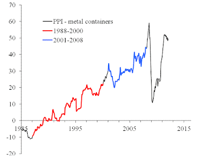
PPI of metals

We have been following the evolution of several price indices of metals since 2008. Our general approach is based on the presence of long-term sustainable (linear and nonlinear) trends in the evolution of the CPI and PPI in the United States. The difference between various components of these indices is not a random one but rather a predetermined process. Using these trends, one can predict consumer and producer price indices for select goods, services and commodities. 
In this post, we revisit the trends in the PPI of three commodities related to metals: steel iron, nonferrous metals, and metal containers. Originally, we reported on these items in 2008 and then revisited in 2010.  
1.               Figure 1 compares the difference between the PPI and the index for iron and steel (101). The difference is characterized by the presence of a sharp decline between 2001 and 2008. Between 1985 and 2000, the curve fluctuates around the zero line, i.e. there was no linear trend in the absolute difference. A year ago we expected the negative trend to start transforming into a positive one as the green line in Figure 2 shows. Our previous predictions were correct. For example, two years ago we wrote:
“Between March and June 2009, the difference continued to increase, and likely reached its peak in June (Figure 2). In July or August 2009, the difference will stall around its peak value and then will start to decrease. As a result, the index for iron and steel will be growing faster than the PPI. In the short run, one can expect a fast recovery of iron and steel prices to the level observed in January-March 2008, i.e. the index will reach the level 210 to 220. However, this recovery will not stretch into 2011, and the index of iron and steel will be declining in the long run to the level of 2001, as depicted in Figure 2.  In other words, the period between 2008 and 2010 is characterized by very high volatility, which will fade away after 2011. “  
2.     The index for non-ferrous metals (102) shows an example of the absence of sustainable trends in the normalized difference. The curve is rather a comb with teeth of varying width. Although varying, the distance between consecutive troughs is several years at least. Therefore, we expect this index to decrease relative to the PPI and the difference in Figure 3 to rise to the level of -10. Non-ferrous metals will be getting cheaper.   
3.             The index for metal containers (103) provides an excellent example of linear trends in the normalized difference (see Figure 4). There are two distinct periods between 1960 and 2008 with a turning point in 1987. As we predicted in 2009, the sudden drop in the difference in the end of 2008 manifested the start of transition to a new period with a negative trend. The price index for metal containers will be increasing relative to the PPI, i.e. the index will get back its price setting power.   

Figure 1. The difference updated for the period between June 2010 and January 2012. As expected, the difference has been decreasing during the reported period and sank below the new trend (green). The trajectory has to turn up in the near future and reach the new trend.  This means that the price index for iron and steel will be growing at a lower rate than the overall PPI.   

Figure 2. The evolution of the difference between the PPI and the price index of iron and steel between January 2005 and January 2012. Green line predicts the evolution of the difference after 2008. Red circles represent the difference between April 2009 and January 2012.
 Figure 3.  The evolution of the difference between the PPI and the index of nonferrous metals from 1985 and January 2012. There are no linear trends in the difference, but its behavior demonstrates a clear periodic structure with relatively deep but short troughs, which reflect the fast growth in the PPI for nonferrous metals. 
Figure 4. The evolution of the difference between the PPI and the index of metal containers from 1985 to January 2012. There are distinct linear trends in the difference. The difference has started its transition to a negative trend.

The rate of unemployment in the UK will likely rise to 9%


We estimated a version of Okun’s law for the UK in July 2011. We developed an integral version of Okun’s law and applied the LSQ method to estimate coefficient in :
u(t) = u(t0) + bln[G/G0] + a(t-t0)  (1)
where u(t) is the predicted rate of unemployment at time t, G is the level of real GDP per capita, a and b are empirical (LSQ) coefficients.   The best-fit (Okun’s) model minimizing the RMS error of the cumulative model (1) is as follows:
du = -0.39dlnG + 0.63 (2)
The most recent estimate on the unemployment rate in the UK is 8.4% for the fourth quarter of 2011 as reported by the NSO for the economically active population between 16 and 64 years of age. The Conference Board has also published an estimate of real GDP per capita for 2011. Figure 1 depicts the observed and predicted curves of the unemployment rate, including the rates for 2011. The overall agreement is very good but the current rate of unemployment is lower than the predicted one by 0.6%.  Figure 1 suggests that the rate of unemployment has been driven by real economic growth and one can expect the rate to grow to the level of 9.0%. The will be no decease in the rate of unemployment if the growth rate of real GDP per growth does not exceed (0.63/0.39=) 1.63% per year.  In 2011, this rate was only 0.09%.

Figure 1.  The observed and predicted rate of unemployment in the UK between 1971 and 2011. 

:: Android 4.0 Ice Cream Sandwich ::

ASUS Transformer ICS 4.0 Update
Android 4.0 Honeycomb v.9.2.1.11 update rolling out now for the Transformer TF101
ASUS prides itself on not only delivering the best products but also continuously improving the experience with regular firmware updates.
If you have an Eee Pad Transformer TF101 then you’ve waited patiently for the promised Android 4.0 Ice Cream Sandwich update and we are excited to announce that the first wave of updates for TF101 firmware v.9.2.1.11 started today in Taiwan.
The update will start to roll out across more regions as the week progresses with the US following on 2/24.

You can check out the gallery above for what’s new for Ice Cream Sandwich on the Transformer TF101. Here’s a run down of some of the key updates:
  • Create folders in the Home Screen
  • Quick launch of the camera from lock screen
  • Additional screen capture method
  • Additional browser functions
  • Special camera effects and photo editing
  • Swipe to close tasks or notifications
  • Font size modification
  • Other minor user interface changes
EnjOy.-))
MamoOn.

No Charge for Membership!

Steven Worth

This is the catchy opening phrase of a products and services pamphlet published by a nonprofit, member-based organization; and it struck me, could this be a harbinger of what is to come in the association world?

Such a statement can only be made by a membership organization that is so confident of the value and quality of the products and services it is offering that they don’t want or need your membership dues to help cover their overhead expenses.  Presumably they keep membership data to better track evolving trends, to market their products and services, and to measure effectiveness, but they have an operational structure with cutting edge IP that does not depend on dues-based income at all….. 
Wow.

How CPI drives the federal funds rate


The interest rate defined by the Federal Reserve is an instrument to control inflation. Ignoring the heaps of quasi-economic lie around the effect of the monetary policy we just present some observations.  Figure 1 depicts the effective rate, R, and the consumer price inflation. The former has to control the latter. One can see that the rate lags behind the CPI since 1980, i.e. inflation grows at its own rate and R has to follow up. The idea of R is that a higher rate should suppress inflation due to the effect expensive money. The reaction of inflation is also expected not momentarily but with some time lag.
The cumulative influence of the interest rate should produce a desired effect in the long run and inflation should go in the direction towards bearable values. Figure 2 displays the cumulative effect, i.e. the cumulative values of the monthly estimates of R and CPI multiplied by 1.4. This is an intriguing plot. In the long run, the R curve fluctuates around the CPI one and returns to it every 15 to 20 years. It seems that the sign of deviation of R from the 1.4CPI curve does not affect the behavior of the CPI. Therefore, the influence of monetary policy is under strong doubt. The Feds have tried all means to return the CPI to R without any success and have to return R to the CPI.  

Figure 1. The federal funds rate, R, and the rate of consumer price inflation, CPI, between 1956 and 2012.

Figure 2. Cumulative values of the monthly estimates of R and CPI multiplied by a factor of 1.4.

Blog Archive