The Temple Dedication


I was just puttering around after work on Tuesday.  I sat down on the couch and I may have even nodded off while watching an episode of “How It’s Made” on Netflix.  When I came to, there was a surreal light in the sky.  I got up and looked out the window and said, “That’s weird.”  The sun was almost setting, and the last rays were reflecting off some clouds over the city and off the mountains. 

I grabbed my camera and rushed to the temple.  I knew that I only had a few minutes to get some fantastic photos.  I really wanted one that I could enlarge into a canvas print, like some I saw at Peach Days.  I wanted to buy one, but not for $325.  So, here are the photos that I took on the first day the temple was in operation.  The scene was stunning.  Another mini-miracle for me of the grandeur and beauty of the Lord’s House and the incredible blessing of having it here in Brigham City.

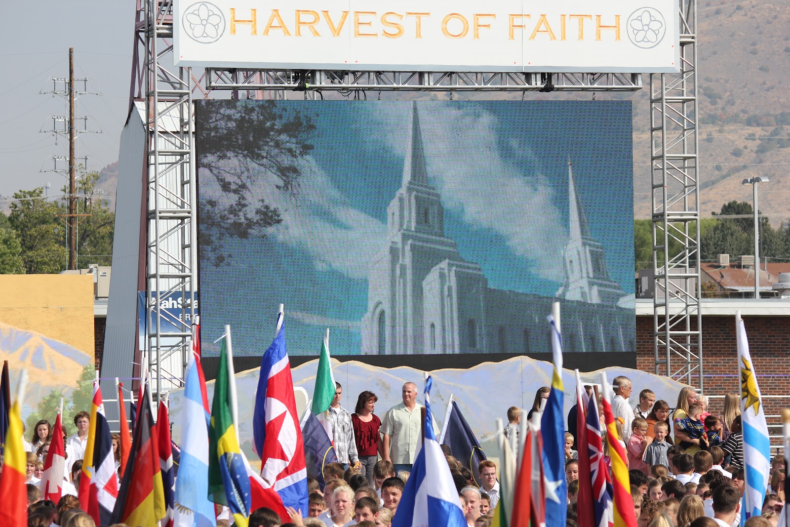
I also thought this would be a good blog to summarize my thoughts and feelings about the temple and the dedication.


I attended the noon session of the temple dedication with my wife.  We sat in the baptistry and watched the dedication on one of the many monitors set up so all could see the proceedings.  I didn't think there was any chance that I would be able to attend the dedication in the temple, but my wife received two tickets from the open house translation and interpretation committee she was a part of.  We even got to sit on the padded benches that face the baptismal font.

I was reflecting on the experience during the week and wondering how the temple has changed me.  Sometimes I still drive by the temple and think it can't be real, but there it is, right on Main Street!

On Monday and Tuesday after the dedication, I made significant progress at work on a problem that has been vexing me for some time.  It was one of those serendipitous moments when I think, yeah!  But, then I realize I must have had a higher power helping me, because I know the inspiration came from beyond me.

The inspiration and power that is manifest in my life is the reason I keep going to the temple to worship and make covenants with my Heavenly Father.  His Spirit blesses my life and my family.

The temple reminds me of the analogy of the pearl and the box.  This story has been told a number of times in General Conference.  It goes like this:

There’s an ancient oriental legend that tells the story of a jeweler who had a precious pearl he wanted to sell. In order to place this pearl in the proper setting, he conceived the idea of building a special box of the finest woods to contain the pearl. He sought these woods and had them brought to him, and they were polished to a high brilliance. He then reinforced the corners of this box with elegant brass hinges and added a red velvet interior. As a final step, he scented that red velvet with perfume, then placed in that setting this precious pearl.

The pearl was then placed in the store window of the jeweler, and after a short period of time, a rich man came by. He was attracted by what he saw and sat down with the jeweler to negotiate a purchase. The jeweler soon realized that the man was negotiating for the box rather than the pearl. You see, the man was so overcome by the beauty of the exterior that he failed to see the pearl of great price.

In my interpretation of the parable, the temple is the box; beautiful, brilliant, polished, and of the highest quality.  We admire the temple for these things, but the most important thing, the pearl, is what is in the temple and that is the Spirit of God. 

In the temple, we make covenants with our Heavenly Father that will allow us to return to him with our families.  That is His plan, made possible through the life, mission, teachings, atonement and resurrection of His Son, Jesus Christ.  Temples direct our thoughts and actions heavenward, to Them.  The "box" is wonderful, but the "pearl" is most important.


Temple Cultural Celebration

The Temple Cultural Celebration was last Saturday.  Of course, if you had kids in it, you already knew that.  I went to the two o'clock dress rehearsal/performance and really liked it.  I was impressed that 4,000 kids could come together and perform so well.  No doubt it was the countless hours the leaders and volunteers spent putting the whole show together.

I can also tell you that my two sons were struggling to last thru one more practice and the 14 hour day that started at 6 am was nearly the last straw.  Now, after a week of reflection, my youngest, says it was fun to be with the other kids, but he didn't like the dancing very much.

I hope my sons can remember this event and the temple dedication the following day for their whole lives.  It was certainly a once-in-a-lifetime event!


Political Calculations on recession in 2013

Ironman @ Political Calculations presented a measure which might indicate recession in 2013: the number of publicly-traded U.S. companies acting to cut their dividend payments each month.
A year ago, we presented a different measure showing a hightened probability of recession.
It seems that the change in populaiton is the reason for the companies to cut dividents.

Exploring Japan: on dismal perspectives of consumer prices

In this post, we continue to validate our predictions of the rate of consumer price inflation (CPI) in Japan by the estimate for 2011. The Japan Bureau of Statistics has estimated the rate of CPI inflation as -0.3%. Now we have an estimate of labour force for 2011 and are able to compare the observed and predicted  figures.  
We have been following inflation in Japan since 2005 when our first paper on the Japanese economy was published and covered the period through 2003. We have revisited inflation in Japan in 2010 and confirmed the predictions of deflation as expressed by the negative GDP deflator. In this blog, we also reported on deflation (both CPI and GDP deflator) several times.  
The case of Japan is the best illustration of our concept linking inflation to the change in labour force. (In a sense, all developed countries stay on the brink of deflation because of the threat of falling labour force.) Therefore we do not suggest the liquidity trap in Japan or any mistakes in monetary policy (inflation does not depend on monetary policy as our model shows.). The evolution of inflation is completely driven by the change in labour force. This is an unfortunate situation for Japan since the level of labour force can only fall in the long run due to the decreasing working age population.   
Previously, we carried out an estimation of empirical relationship between the change rate of labour force, dlnLF(t)/dt, and inflation, p(t).  
First, we test the existence of a link between inflation and labour force. Because of the structural (likely related to definition and measurement procedure) break in the 1980s, we have chosen the period after 1982 for linear regression. By varying the lag between the labour force and inflation one can obtain the best-fit coefficients for the prediction of CPI inflation, p(t),  according to the following relationship (updated with new data since 2009): 
p(t) = 1.39dlnLF(t-t0)/dt + 0.0004                                (1)
where the time lag t0=0 years; standard errors for both coefficients are shown in brackets.  Figure 1 (upper panel) depicts this best-fit case. (The period after 2003 is highlighted.) There is no time lag between the inflation series and the labour force change series in Japan. Free term in (1), defining the level of price inflation in the absence of labour force change, is statistically undistinguishable from zero.
A more precise and reliable method to compare observed and predicted inflation consists in the comparison of cumulative curves. Short-term oscillations and uncorrelated noise in data as induced by inaccurate measurements and the inevitable bias in all definitions should be smoothed out in cumulative curves. Any actual deviation between two cumulative curves persists in time if measured values are not matched by the defining relationship.
The predicted cumulative values shown in the lower panel of Figure 1 are very sensitive to the free term in (1). For Japan, the cumulative curves are characterized by complex shapes. There are periods of intensive inflation and a deflationary period. The labour force change, defining the predicted inflation curve, follows all the turns in the measured cumulative inflation.
One can conclude that relationship (1) is valid and the labour force change is the driving force of inflation. Statistically, the evolution of the overall level of consumer prices in Japan is fully defined by the change in labour force. Hence, no other variable or process can affect the change in price. Otherwise, the statistically reliable link would not exist.  
Having the projection of labour force borrowed from the National Institute of Population and Social Security Research, one can predict the future of CPI inflation in Japan. It will be decreasing to the level of -1% per year in 2050.  
Conclusion: invite immigrants and start a baby boom today! Otherwise, the level of consumer prices in 2050 will be a half of that of today.  
 
Figure 1. Measured inflation (CPI) and that predicted from the change rate of labour force. Upper panel:  Annual curves. Lower panel: Cumulative curves between 1982 and 2011. A good agreement between the cumulative curves illustrates the predictive power of our model.
 
Figure 2. Scatter plot: predicted vs. measured rate of CPI inflation.
Figure 3. Projection of the labour force evolution between 2005 and 2050.

Figure 4. The rate of CPI inflation in Japan through 2050.

Granola Chocolate Bars

 I made this for Liana's breakfast pack to school - simple and quick to prepare at night before and ready in the morning without much fuss for everyone's light breakfast. The bars are stuffed with cereals and nuts so just perfect for the boys' as light snack before having a heavier breakfast later in the college.

By: Roz@HomeKreation
Size: 9" square tin
INGREDIENTS:
4½ cup Granola Cereal
100g Butter
250g Bittersweet Chocolate
180g Condensed Milk

METHOD:
1. Melt chocolate in microwave for 1 minute & add in condensed milk.
Melt butter in microwave in a separate bowl & mix into chocolate mixture.
Mix in Granola cereal until well coated.

2. Line tin with parchment paper, overhang on two sides - so that it can be easily lifted out later.
Press mixture into the tin.
Let is set in fridge before slicing.

BAHASA MALAYSIA VERSION
Along buat ni untuk Liana bawa bekal ke sekolah untuk sarapan pagi. Liana cerewet makan, yg ini boleh juga tarik perhatian dia sebab ada coklat. Kebiasaan nya, Along tak benarkan Liana makan coklat tapi sebab yg ini ada bijirin dan kekacang yg boleh mengenyangkan, so ok lah sekali-sekala.

Nak buat ni senang sangat2 - sediakan pada malam nya dan esuk pagi hidangan sarapan seisi keluarga sudah sedia. Ni kira lapik perut je sebelum the boys rihat sarapan di kolej. Buat kudap2 bila2 pun boleh....

Resepi ni lebih-kurang cam Kek Batik Coklat yg Along buat sebelum ni.

By: AlongRoz@HomeKreation
Size: 9" square tin
BAHAN2:
4½ cwn Granola Cereal
100g Butter
250g Bittersweet Chocolate
180g Susu Pekat

CARA2:
1. Cairkan coklat dlm microwave selama 1 minit. 
Campurkan susu pekat sehingga sebati.
Cairkan butter dlm microwave 30 saat dlm mangkuk yg berasingan & campurkan sebati dgn adunan coklat.
Masukkan Granola Cereal & gaul sehingga rata.

2. Lapik tin dengan kertas - pastikan kertas terlebih panjang di dua hujung.
Tekan adunan ke dalam tin supaya rata.
Simpan dalam peti sejuk sehingga coklat keras.
Potong & hidangkan.

Before sliced
 

Oil price in 2012-2013


This is a revision to our oil price prediction as based on the difference between the overall PPI and the index of crude oil. Figure 1 compares our previous prediction in May 2011 with actual oil price in 2011 and 2012. In August 2011, the predicted price was a bit higher than the measured one. We expected the price to fall by approximately $5 per month to the level of ~$70 by December 2011. In reality, the price reflected from the high bound of the expected price (dashed line) and grew during the end of 2011. This effect reflects the high level of price volatility during short time intervals. Since February 2012, the price has been returning to the expected price range which expresses the slow fall through 2016, with the uncertainty bounds for the long-term trend in oil price shown in Figure 1. The level of oil price in 2016 is expected between $30 and $60 per barrel.
Here we confirm the oil price trend and its bounds. Red squares show our prediction of oil price through February 2013. Despite local fluctuations, the trend is negative and will bring the price to $45 (±$15) per barrel in 2016.  
Figure 1. The evolution of oil price since 2001 as estimated from the differnce of the overall PPI and the PPI of crude petroleum.

CPI and core CPI. A half-year report


We have been routinely reporting on the difference between the headline and core CPI since 2008. Figure 1 illustrates our general finding that this deference can be well approximated be a set of linear trends. The last trend likely finished in 2009. That’s why we expected a new trend to evolve since 2010 into the late 2010s.
The U.S. Bureau of Labor Statistics has reported the estimates of various consumer price indices for August 2012. Figure 2 shows the predicted trend and the actual difference since 2010. The difference has been fluctuating around zero between June 2011 and  January 2012 and then showed a turn to the predicted trend.  Essentially, the zero difference suggests that the core and headline CPI are practically equal and evolve at the same monthly rate, i.e. the joint price index of energy and food has been following the price index of all other good and services (the core CPI) one-to-one.
Currently, the price index of energy slowly falls together with oil price. We expect them to fall deeper and thus the headline CPI to decelerate a bit together with energy. If the core CPI will retain its current cohesion with the headline CPI, we will have a period of very low inflation in all goods and services less energy and food. 

Figure 1. Two trends in the difference between the healine and core CPI.


Figure 2. The evolution of the difference between the core and headline CPI since 2002.

The effect of measuring procedure on Gini ratio estimates


The Census Bureau publishes Gini ratio for households as based on the Current Population Surveys conducted every March. Unfortunately, the CPS data are not compatible over time. (Actually, the CB mentions that in footnotes, but this is not the best place for general public and even for experts.) Therefore, the estimates of Gini ratio are biased and cannot be used in order to characterize the evolution of income inequality in the US. At the same time, each estimate is accurate to the extent the data and calculation procedures allow. Here we present the case of changing data granularity in 2009 which affected the estimates of Gini ratio for various household sizes.  

It is well known that the total income increases with time due to the increase in nominal GDP and population growth. The Census Bureau was measuring the household income distribution in $2500 bins with the upper limit of $100,000 since 1994. All households with income above $100,000 were counted in the open-ended ”$100,000 and above” bin. In 1994, there were 6,581,000 households in this bin and the portion of income was only 26%. This is not good for the Gini ratio estimation since one bin cover a quarter of all total income. In 2008, this bin accommodated 51% of total income. Such a bin counting is too crude and it makes the Gini ratio calculations almost worthless. Since the higher incomes are distributed according to the Pareto law, i.e. a power law, the CB can and does calculate the Gini ratio analytically for higher incomes.

In any case, the Census Bureau had to increase the bins to $5000 and the upper limit to $200,000 together with calculation of Gini ratio with bin counting up to $250,000 (the readings in the bins above $200,000 are not published!).   For the convenience of the CB, this change is appropriate. But it induced a step in the Gini ratio time series. Figure 1 displays the jumps for households of various sizes – from one person to seven+ people. Since households with more people have higher incomes one can expect that the portion of households with $100,000+ income increases with household size. The change in bin granularity and the upper limit from 2008 to 2009 has to change this portion and induce a step in the Gini ratio series.  Table 1 lists these portions for 2008 and 2009 as well as their ratios.

Table 1. The portion of households with income above $100,000 in 2008 and $200,000 in 2009.
2008
2009
ratio
One person
0.054
0.008
6.52
Two people
0.213
0.037
5.69
Three people
0.270
0.048
5.61
Four people
0.339
0.068
4.99
Five people
0.311
0.071
4.36
Six people
0.282
0.057
4.90
Seven people or more
0.278
0.053
5.20


We illustrate the step in Gini ratio using the overall income distribution. The overall Gini was calculated using the Pareto law approximation for the higher incomes and thus is not biased as the estimates of individual household sizes.  Figure 2 depicts three Lorentz curves based on the relevant CB estimates of household income distribution in 1994, 2008, and 2009. One can see a dramatic difference in Lorentz curves in 2008 and 2009. The high income bin with a half of total income makes the 2008 Gini ratio to be highly underestimated compared to the 2009 estimate. Both curves are identical for 85% of population, however. The 1994 curve also coincides with the 2009 one up to the last bin. Table 2 compares our estimates of Gini ratio and those reported by the CB. One can see that the 2008 CB estimate is corrected, but the step of 0.023 well reproduces the step observed for the individual household sizes in Figure 1.

Table 2. The estimates of Gini ratio in this post and those reported by the CB.
Gini ratio
CB Gini ratio
2009
0.466
0.465
2008
0.443
0.466
1994
0.457
0.456


Figure 1. The evolution of Gini ratio for individual household sizes. Notice the step between 2008 and 2009.

Figure 2. The Lorentz curves for household income distribution in 1994, 2008, and 2009, as constructed from the CB income distributions without approximation of the higher incomes by the Pareto law.

Blog Archive