An editorial written by Australian undergraduate Luke Mansillo to the Economist aptly drew attention to somewhat misleading figures regarding Australia’s beer consumption used in an Economist article published May 5th. According to the May 5th article, beer consumption in Australia has plummeted to just 4.5 litres (7.5 pints) per person annually, a 65-year low. Howeve, in his editorial, Mansillo points out that, while Australian beer consumption is in fact at a 65-year low, the figure used in the article was litres of pure alcohol content. According to Mansillo, the figure in terms of volume is much higher at 98 litres (172 pints) per person annually. The Economist has subsequently clarified this in a correction in which both figures are included.

Data in Review: The Price of Movie Tickets
Why do all movie tickets cost the same? Movie tickets don't fluctuate in price according to supply and demand. Blockbuster sellouts and movie flops all sell for the same price. To explain this occurence, an article from The Atlantic briefly explains the history of movie prices, demonstrating that during the first half of the twentieth century, movie tickets used to cost different amounts depending on their actors and popularity. Since this time, the system gradually shifted so that ticket prices from the 1970s onwards have been generally uniform across movies.
 The line graph depicts how theater attendance fluctuates through the year. Christmas is shown as the high point of the year in terms of ticket sales, while the time periods directly following Easter and Labor Day see relatively low ticket sales.
The chart does have a few shortcomings, however. The article fails to tell us the data's source. We do not know whether the graph is plotting the data from a single theater, or from an aggregate of theaters of over the course of a year. We also don't know when the data were collected. The article doesn't communicate what year or years the data come from, and there is no caption or title to further explain these details. It is also unclear what the unit of measurement is. Does 12% average weekly attendance convey the proportion of seats that are filled in a theater? Does 4% attendance during a given week represent how much that this specific week accounts for in the year's attendance?
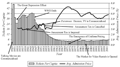
Though displaying several trends on one set of axes, the second graph is significantly clearer. The graph shows tickets per capita and the average price of a ticket from 1929 through 2001. Unlike the first graph, the axes are well labeled and they clarify the unit of measure. Although the bar chart and trend graph are superimposed on each other, they utilize the better part of the chart area. Unfortunately, the chart does not include the source of the data or a title, both of which would further clarify the the meaning of the information being represented. It would also be useful to articulate whether admissions prices are adjusted for inflation, a factor that is necessary to take into account when looking at such a large time span.

The chart does have a few shortcomings, however. The article fails to tell us the data's source. We do not know whether the graph is plotting the data from a single theater, or from an aggregate of theaters of over the course of a year. We also don't know when the data were collected. The article doesn't communicate what year or years the data come from, and there is no caption or title to further explain these details. It is also unclear what the unit of measurement is. Does 12% average weekly attendance convey the proportion of seats that are filled in a theater? Does 4% attendance during a given week represent how much that this specific week accounts for in the year's attendance?

Though displaying several trends on one set of axes, the second graph is significantly clearer. The graph shows tickets per capita and the average price of a ticket from 1929 through 2001. Unlike the first graph, the axes are well labeled and they clarify the unit of measure. Although the bar chart and trend graph are superimposed on each other, they utilize the better part of the chart area. Unfortunately, the chart does not include the source of the data or a title, both of which would further clarify the the meaning of the information being represented. It would also be useful to articulate whether admissions prices are adjusted for inflation, a factor that is necessary to take into account when looking at such a large time span.
Pew report shows generation gap in 2012 election voting, though not as definitively as is suggested
The Pew Research Center released a report on age and voting trends this week, attempting to shed light on the potential effect of generation on votes in the 2012 presidential election. The unabridged study claims that "Millenial generation voters are inclined to back Barack Obama for reelection by a wide margin in a match-up against Mitt Romney," whereas Silent generation voters strongly back Romney and Generation X and Baby Boomers hold mixed opinions.
 The report certainly highlights the current national public opinion amongst varying age groups. However, the graph included in the brief summary presents the data in a misleading format. Although the data points before 2012 show national exit poll data, the 2012 points show "2012 preference based on registered voters." While this may indicate the trend we may observe next year, the predictive 2012 points are misleadingly placed in the same series as more concrete data from past elections. A number of factors (such as get-out-the-vote and campaigning efforts) could influence the so-called "young-old voting gap" in the twelve months leading up to the presidential election. In addition, the Young-Old Gap figures are presented in a confusing, unexplained format. However, Pew's extended report discusses an issue that is at the forefront of much recent election research: divided public opinion in a potential Obama-Romney general election.
CF
The report certainly highlights the current national public opinion amongst varying age groups. However, the graph included in the brief summary presents the data in a misleading format. Although the data points before 2012 show national exit poll data, the 2012 points show "2012 preference based on registered voters." While this may indicate the trend we may observe next year, the predictive 2012 points are misleadingly placed in the same series as more concrete data from past elections. A number of factors (such as get-out-the-vote and campaigning efforts) could influence the so-called "young-old voting gap" in the twelve months leading up to the presidential election. In addition, the Young-Old Gap figures are presented in a confusing, unexplained format. However, Pew's extended report discusses an issue that is at the forefront of much recent election research: divided public opinion in a potential Obama-Romney general election.CF
Data Gone Wrong: Chart on Debt Increases
 In one of last week's Washington Post "Fact Checker" blogs, Glenn Kessler gives a rather scathing review of a chart (above) created by the office of House Minority Leader Nancy Pelosi in May. The chart, based on data but not calculations made by the US Treasury Department, has gained attention in social media. As pointed out by Politifact and subsequently corrected by Pelosi's office, the original chart included a major math error by calculating debt increases as if Obama had taken office a year later than he did, cutting his actual debt increase by more than a half and increasing George W. Bush's significantly. Despite Politifact drawing attention to the error and the correction, the original chart is still being proliferated according to Kessler, who saw it in his Facebook "newsfeed" recently.
In addition to this more obvious error, Kessler points out the misleading nature of percent changes in raw debt figures - because Obama was faced with a substantially higher debt when he came into office than his predecessors, it would have taken a much greater nominal increase in the debt to achieve the same percentage increases. Kessler also points out use of gross debt measures rather than public debt measures. Although not technically "misleading," it is worth noting that had the chart used public debt figures rather than gross debt figures, Obama and George W. Bush would have had nearly the same debt increases (60% and 70% respectively) despite Bush's longer term. On his Pinocchio standard, which rates claims made by political figures or groups in fact-checking, Kessler gave Pelosi's chart "Four Pinocchios," which is reserved only for true "whoppers."
Kessler suggests that the debt increase as a percentage of gross domestic product as a more economically informative measure and, using White House Budget Office Historical Tables, calculated the following figures for each President: Although these figures are less flattering for Obama, Kessler notes that he is "battling a recession."
BL cf


