
U.S. Department of Commerce Reports Large Decrease in American Durable Goods

Crude and steel still in sync
We have been reporting on the trade-off between the producer price index of crude oil (domestic production) and the PPI of iron&steel since 2009. It has been always a linear and lagged link between them. Our previous update included PPI data through March 2012. Here we present an annual wrap-up.

Figure 1. The deviation of the iron and steel price index and the index of crude oil from the PPI, normalized to the PPI.


Conclusion
We reported that the PPI of crude oil had been likely evolving in sync with that of iron and steel, but with a lag of two months in September 2009. In order to present both indices in a comparable form, the difference between a given index, iPPI (i.e. iron&steel and crude), and the overall PPI was normalized to the PPI: (iPPI(t)-PPI(t))/PPI(t). These normalized differences represent the evolution of the rate of deviation from the PPI over years.
Figure 1 depicts the corresponding time histories of the normalized deviations from the PPI, including the most recent period through August 2012. Even a simple visual inspection reveals the following feature: the (normalized deviation from the PPI of the) index of iron and steel lags by approximately two months behind the (normalized) index of crude oil.

In order to reduce both deviations to the same scale we additionally normalized the curves in Figure 1 to their peak values between 2005 and 2012.
(iPPI(t)-PPI(t))/[PPI(t)*max{iPPI-PPI)}]
This scaling allows a direct comparison of corresponding shapes. In Figure 2, we display the normalized index of iron and steel shifted by two months ahead to synchronize its peak with that observed in the normalized index for crude petroleum. The scaled index of crude demonstrates just short-term deviations from the index of iron and steel in the overall shape and timing of the peak and trough. Simple smoothing with MA(3) makes the curves resemblance even better. As an extra benefit of the resemblance, one can use the two-month lag to predict the future of the iron and steel price index.


Figure 2. Deviation of the iron and steel price index from the PPI, normalized to the PPI and the peak value after 2005 as compared to the deviations of the index for crude petroleum normalized in the same way. The normalized index for iron and steel is shifted two months ahead.
Conclusion
The link between oil and iron has been unbreakable. Between 2006 and 2012, the deviation of the price index of iron and steel from the PPI in the USA repeats the trajectory of the deviation of the index of crude petroleum (domestic production) with a two-month lag. Therefore, the prediction of iron and steel price for at this horizon is a straightforward one.
How the household split affects the household Gini ratio
The average household size has been decreasing since the start of measurements in 1967. Between 1994 and 2007, the average household size fell from 2.61 to 2.55, and the overall household Gini ratio increased from 0.456 to 0.463. In 2009, a new measuring procedure was introduced and all estimates of Gini ratio were subject to artificial corrections due to the change in data granularity and the overall coverage by income bins.
Here we argue that the change in Gini ratio results from the change in the household size distribution. We demonstrate the effect of the average household size on Gini ratio using the household size distribution measured in 2011. This year is convenient since it covers with $5000-wide bins incomes up to $200,000. This leaves 5,106,000 households from 121,084,000 in the income bin above $200,000. The average household size in 2011 was 2.55. Figure 1 presents the distribution of households over sizes. One can calculate that with the given size distribution and average size, the mean size in the 7+ (seven and more people) group is 11.9 people.

In order the average household size to decrease, bigger households should split and create an excess of smaller size households with lower incomes. As an alternative, a larger number of smaller households (with lower mean income) should be created. Both processes reduce the relative number of households with many people and increase the number of small-size households.
Without loss of generality, we split all six people households with incomes below $100,000 into two equal households having a half-income. Therefore, instead of one six people household with $50,001 income we have two three people households with $25,000.5 income. These two households are now in the group of three people households with incomes between $25,000 and $30,000. One can expand this procedure to any household size and to any permutation of sizes. (For example, a six people household might be split into two households of 2 and 4 people, or three two-people households, etc.) The only requirement is the same total income of the pieces. This process is linear and the final mean size is a function of all splits. Here we just demonstrate the principle. Figure 2 presents the original income distribution of six people households. Figure 3 depicts the original income distribution of three people households and that obtained after the split of all six people households in Figure 2 into equal (size and income) pieces.

Figure 2. Income distribution of six people households between $0 and $100,000.

Figure 3. Original (red) and corrected (blue) income distribution of three people households between $0 and $50,000.
We have split 1,953,530 households and obtained extra 1,953,530 households with the total number of 123,037,000 households. The average household size decreased from 2.55 to 2.51 since bigger households were replaced by a larger number of smaller ones.
The total income does not change since all new households retain the income of split households. The income distribution has changed, however. When calculating the Gini ratio for the new income distribution we have to take into account the change in the mean income in all income bins between $0 and $50,000 due to additional three people households.
We have calculated the Lorenz curve (Figure 4) and then estimated the Gini ratio for the new income distribution. The original Lorenz curve (red) lies above the new one (blue). This is the reason why the Gini ratio is higher for the new income distribution: it increased from 0.4697 to 0.4746. This gives an increment of 0.005 as related to the 0.04 fall in the average household size (2.55 to 2.51). Considering the overall decrease in the average size by 0.06 between 1994 and 2007, one may expect the Gini ratio rise by 0.0075. The actual figure is 0.007. Hence, the change in Gini ration can be fully explained by the change in the average household size.

Figure 4. The Lorenz curve for the original (red) and new (blue) income distribution.
Hospital Errors Kill 98,000 Americans a Year

Marty Makary, writing for the Wall Street Journal, highlighted the disturbing trend of errors in the medical field and the deadly consequences these errors lead to. Based on data from the Institute of Medicine, hospital errors kill 98,000 patients a year, and 1 in 4 hospitalized patients are harmed in some fashion by hospital errors. If hospital errors were a disease, they would be the sixth leading cause of death in America – ahead of Alzheimers. Surgeons have even been known to operate on the wrong body part as frequently as 40 times per week. The issue of hospital errors is often overlooked due to the fact that hospital performance statistics are difficult to attain, and for the simple fact that the public is more than willing to trust a medical institution.
Why the dangerously high number of errors? Makary's analysis points to a lack of teamwork. Many employees across America’s hospitals report poor levels of teamwork, an aspect of hospital dynamics that makes it difficult to recognize and prevent mistakes. Makary suggests installing cameras, providing patients with online access to medical histories and charts, and simply opening a dialogue on the deadly consequences of medical errors as solutions to the problem.
Why the dangerously high number of errors? Makary's analysis points to a lack of teamwork. Many employees across America’s hospitals report poor levels of teamwork, an aspect of hospital dynamics that makes it difficult to recognize and prevent mistakes. Makary suggests installing cameras, providing patients with online access to medical histories and charts, and simply opening a dialogue on the deadly consequences of medical errors as solutions to the problem.
The jump in Gini ratio in 2009 is fully artificial
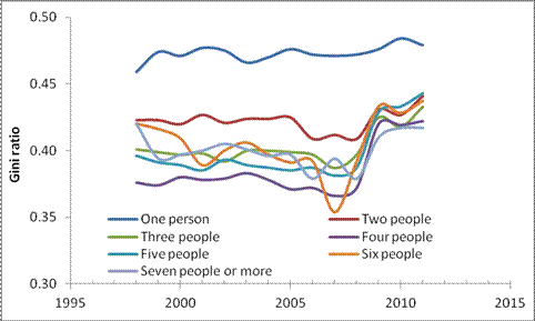
Figure 1 depicts the evolution of Gini ratio for various sizes of households. We mentioned before that in 2009 there was a revision to the procedures and bins of household income measurements during the Current Population Survey. One can see that there is a jump in all household sizes between 2008 and 2009. Effectively, this jump is fully artificial and there is no change between 2010 and 2011 as mentioned in blogs and academic papers. Also notice that there was a fall in 2006 also induced by major revision in 2005. For all changes, the reader may check the Census Bureau web site.
All in all, the household Gini has not been really changing over time.
Comparison of Gini ratios for various household sizes: 1998 vs. 2007.
In the previous post, we presented the difference in income distributions for household sizes from one person to seven and more people as observed in 1994 and 2007. Unfortunately, there are no Gini ratio estimates in 1994 for specific household sizes. The first year when the Census Bureau reported these estimates was 1998 and here we compare Gini ratios for 1998 and 2007 together with now standard presentations of normalized income distributions. We use 2007 because in 2009 the CB changed the width of income bins to $5000 and increased the high-end limit to $200,000. Therefore, the measurements before and after 2008 are not compatible. Since nominal GDP was higher in 2007 than in 2008 it is reasonable to use 2007 as a reference year.
Again, we do not repeat the technical part which was well described in this post. Briefly, we showed that the household Gini is biased up in 2007 relative to 1994 because the portion of smaller and thus lower income households increased. Accordingly, the average size decreased. To do this, we normalized the household income distribution to the total number of households and corrected the income bins to the total increase in nominal GDP and the change in the total number of households. This operation is similar to that used for the Lorenz curve calculation.
Figure 1 compares Gini ratios in 1998 and 2007. For all sizes except the one-person-households, the Gini ratio slightly fell since 1998. The increase in one-person households might be related to the increase in the portion of population without income (see this post). In any case, the claim of increasing income inequality among households is not supported by these observations. The dispersion of household incomes (with two or more people) has been decreasing. This is the change in size distribution what actually induced the reported increase in the overall Gini ratio. Since the data granularity increased in 2009, the upper open-ended interval for Gini calculations increased to $250,000, and the interpolation within income bins was changed to the Pareto law, one should not compare the years before and after 2008.

As in our previous post, Figure 2 compares the household income distributions (density functions).. There were relatively more small-size households with one and two people in expense of mid-income households of 3 and more people. Not having the 1998 Gini estimates, we may say that the Gini for the small-size households increased and accordingly decreased for the larger households. But the effect of changing dispersion (and thus Gini) in any household size is likely smaller than the effect of larger households split with the creation of an excess of smaller households.


Figure 2. The evolution of income distribution density functions in various household sizes.
The evolution of income inequality in households of various sizes
In one of our previous posts we addressed the issue of the household Gini ratio dependence on the average household size. We demonstrated that the Gini has not been increasing, as many economistssay, but was actually constant as the Gini for personal incomes [1, 2].
We would not repeat the technical part of the post. Briefly, we showed that the household Gini is biased up in 2007 relative to 1994 because the portion of smaller and thus lower income households increased. Accordingly, the average size decreased. To do this, we normalized the household income distribution to the total number of households and corrected the income bins to the total increase in nominal GDP and the change in the total number of households. This operation is similar to that used for the Lorenz curve calculation.
In this post, we present the evolution of income distribution in various household sizes and the same procedure as for the whole distribution. Unfortunately, there are no estimates of Gini ratio in all household sizes for 1994, but Figure 1 depicts these estimates for 2007.

Figure 1. Gini ratio as a function of the household size in 2007.
Figure 2 compares the household income distributions (density functions) in 1994 and 2007. There were relatively more small-size households with one and two people in expense of mid-income households of 3 and more people. Not having the 1994 Gini estimates, we may say that the Gini for the small-size households increased and accordingly decreased for the larger households. But the effect of changing dispersion (and thus Gini) in any household size is likely smaller than the effect of larger households split with the creation of an excess of smaller households.


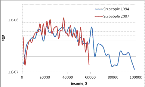

Figure 2. The evolution of density functions in various household sizes.


