OK! I left you last week with some tips on picking out paint, specifically paint at my favorite place, Sherwin-Williams. Now it’s time to get into the nitty gritty of how I picked out the colors for our family room and ceiling.
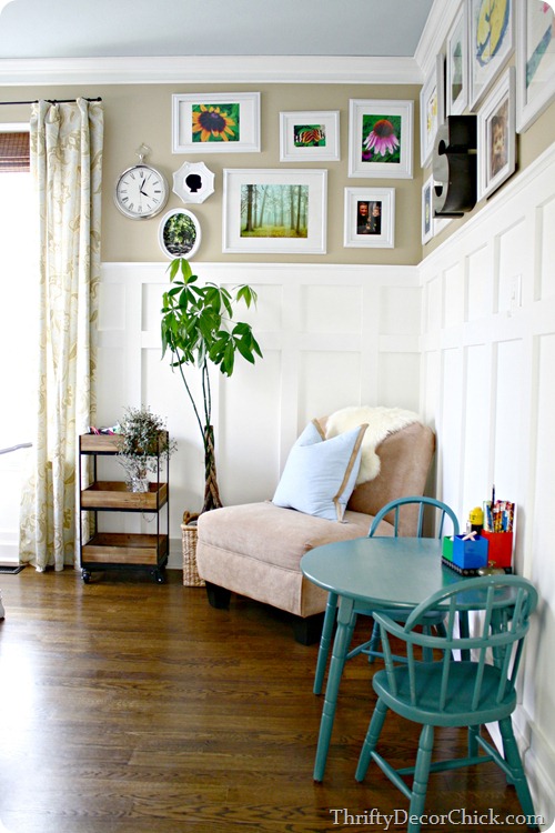
The ceiling needed to be addressed first because of all the patching that needed to be done from taking down the wall. My old office had that pretty blue ceiling that I loved:
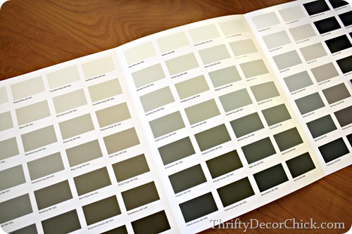
I loved that color but didn’t want to go quite so blue for such a huge room. So I decided to go a little bit lighter, and I got my inspiration from one of the paint chip booklets they had in the store: 
This one is perfect when you’re looking for a white or a light neutral. It really shows the difference between all the “whites” right?:
I wanted something with a very slight blue to it so I went with Rhinestone off that sheet, but at half – so 50 percent lighter than what the chip showed.
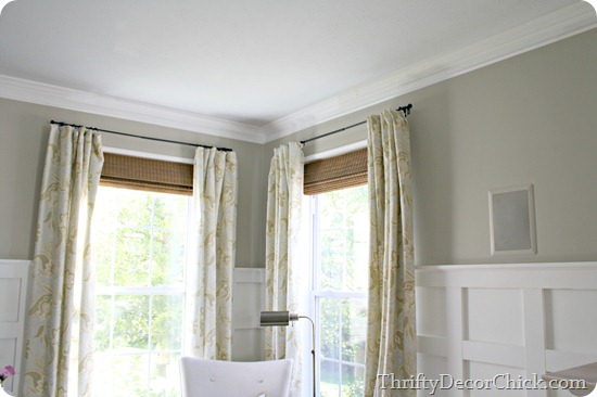
I’m glad I went lighter because I think the full color would have been too dark for the ceiling. This is a very light blue gray color:
I think a blue tone on your ceiling will makes a room feel more airy – almost like the ceiling isn’t as noticeable because it kind of goes away.
I think other than the color the hardest and biggest decision to make is what type of paint to use. There are a ton of options at Sherwin-Williams so it can be overwhelming if you don’t know what they all mean. Thankfully they spell it out quite well:
I talked to the manager at the store to find out more before picking out the ceiling and wall paints. Since the color we were using on the ceiling was similar to what was there before and we needed so much of it, we went the basic HGTV HOME by Sherwin-Williams paint in a flat sheen.
The sheen is SO important when picking out paints, especially on a ceiling. The only time you’ll want a shiny ceiling is if you have flat (non-textured) ceilings and you’re going for a more modern look. I don’t care for a shine on my ceiling at all, so it’s always flat for me. Even the slightest reflection drives me crazy. :)
The walls are a different story:
I always go with a satin or eggshell for my walls. Long ago I used to use semi gloss for bathrooms because I heard that’s what you’re supposed to do for cleaning reasons. No more. I don’t like that much reflection on all the walls so the low-shine of the eggshell is perfect for me. There is one area that I use semi gloss on though -- my trim projects like board and batten. I just like the look of it and it gives a nice contrast against the walls.
Here’s the thing -- glossy paints will show a lot of imperfections in the walls – so if you have wavy walls or lots of holes that have been filled, it’s not for you. Flat hides those imperfections well but is not easy to clean. It’s also sometimes too flat with no dimension at all, so be aware of that. My go-to is eggshell (or satin, very similar) and is still scrubbable with just enough shine that it gives it some life.
I liked the other chip sheet so well I went to another one to look for the perfect wall color. I’ve had the same color on the wall for ten years! It’s time for a change. This book is called Essentials and includes a ton of their most popular neutrals:
It was there that I fell in love with the Anew Gray color. I got a sample from the store (see my previous post on picking out paint colors!) and tried it out on a wall. At first I wasn’t sure it would be a big difference from the previous color, but after seeing it on the wall the difference was huge:
It’s a lovely stone gray color…but it was a little too stone for me. Too gray and not enough warm, you know? So I kept at it with some more samples and some colors I’ve used in other parts of the house.
First I tried Amazing Gray and Useful Gray (left to right) after the Anew Gray:

THEN I tried the colors I’ve already used in our home to see how I liked them. The fourth color from the left is my beloved Analytical Gray that I used on the rest of the main floor and some upstairs. The one on the end was the Agreeable Gray color that I used in the powder room.
Look how different it looks in natural light compared to that room!:
I think that’s crazy. Just goes to show you need to try your colors out – even when you’ve used them before!
I knew the second that Analytical Gray went up that it was the one. It has a bit of the gray tone but is still a warm color. And it looked great with all the light in this room! I really wanted to change things up from the rest of the main floor but when you love a color you love a color. :)
With that decision finally made I went for it! The manager at Sherwin-Williams recommended the Harmony paint line since it has zero VOCs. I didn’t smell a thing as I was painting or after:
I used this Harmony paint in the basement as well and LOVE how well it covers.
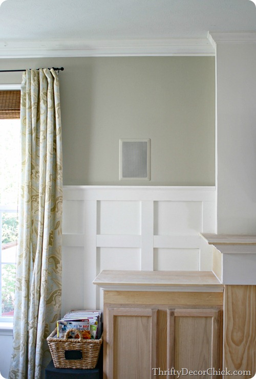
I’m SO HAPPY to have this decision made! I love this color so much. Here’s how the corner I showed you earlier this week looks with the new wall and ceiling color:

Slowly but surely I’m patching the board and batten, replacing molding and getting things touched up. Still have to paint the crown but it’s almost there!:
Painting the built ins and fireplace needs to happen too. My list is long. :)
So there you have it – the process I went through to pick out the family room paint colors. NOW to get all that board and batten trim up and caulked and painted and the rest of the walls painted…I’m getting there slow but sure!
How many samples have you put on the wall before deciding on the ONE? I’m pretty sure I read that one of you has 18 on the wall right now? You’ve got me beat. ;)
*The $200 Sherwin-Williams paint giveaway is now closed.
*I partnered with Sherwin-Williams for this project but all thoughts are my own.


0 komentar:
Post a Comment