There is an important problem raised by Coding Monkey in the comments to this post on the evolution of household sizes (supported by the Arthurian). With the mean size of household decreasing since 1967, who is responsible for the fall – poor or rich households? I did not study this problem before and my first guess is that richer (and bigger) households have to split first. Their pieces are financially and logistically more viable than poor households. The latter have to retain their sizes in order to save money for living.
The Census Bureau provides some data to answer this question quantitatively. Unfortunately, the CB changes its rules and procedures as other statistical agencies. This makes impossible a direct comparison of data from different years. For example, the CB changed the bin size in 2009 to $5000 from $2500 between 1994 and 2008. It is difficult to compare mean household sizes in different bins and there is no possibility to merge two mean sizes in $2500 bins in one mean household size in $5000. Thus we can directly compare only 1994 and 2008. However, the choice of 2007 seems more attractive because it provides the highest real GDP.
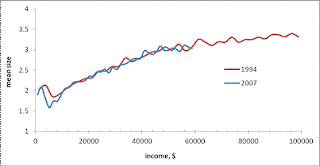
Figure 1 directly compares mean household sizes in $2500 bins between $0 and $100,000 in 1994 and 2007. One can see that the mean household size fell in all bins. A quick and wrong interpretation is that poor households merged and created bigger ones residing above $100,000. This is not true because of several important changes between 1994 and 2007. The total number of households rose from 98,990 to 116, 783. The level of nominal GDP rose by a factor of 1.98, including real GDP increased by a factor of 1.49.
All these changes are not taken into account in Figure 1. The total number of households may not affect the mean size when all newly created households repeat the overall distribution. This means that the mean size is retained the same in any income bin if the size distribution in this bin does not change.
The change in nominal GDP does change the distribution in Figure 1. What we want to know is what did happen to the 2007 households that would occur in 1994 bins? One can imagine that $2500 in 1994 is not equal to $2500 in 2007. We have to scale the income axis according to the total change in GDP per one household. There are two components of the change – price inflation and real GDP growth per household. The former process shrinks the income scale by the factor of 1.30, i.e. the overall change in prices between 1994 and 2007. The growth in real GDP from 1994 to 2007 is 1.49. If the number of households is the same, a 2007 household should have income by a factor of 1.98 higher than in 1994. However, there are 1.18 times more households in 2007 and an average household would have income by a factor of 1.68 larger than it would have in 1994. All households with income $100,000/1.68= $59,523 in 1994 have to move above $100,000 in 2007 and to fall in the bin “$100,000 and above”.
After scaling by a factor of 1.68, all bins in 2007 repeat the bins in 1994. Figure 2 displays the dependence of the mean household size on income with the scaled axis for 2007. Effectively, the 2007 curve in Figure 1 has been shrunk and shifted left. As a result, one cannot distinguish between two curves except the very low income bins. This is an obvious result that the low income bin is populated by one-person-households. We again have a problem of the changing average household size. These estimates do not help much to resolve this problem.
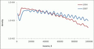
Another way to address this problem is to estimate the density of households in all income bins. Figure 3 displays the number of households in a given bin normalized to the total number of households in 1994 and 2007, respectively. The income bins in 2007 are also scaled as discussed above. Therefore, the graphs present the portion of household in a given bin. The 2007 curve is below that of 1994. The reason is simple – bins are different in 1994 and 2007. In order to compare curves in Figure 4 in an appropriate way, we have to calculate the distribution density, i.e. the portion of households per $1. In Figure 5 we normalized the curves in Figure 4 to their respective widths and obtained two density curves, which are very close. The 2007 curve seems to be higher at lower incomes and lower at higher incomes. Therefore, the average size in 2007 has to be smaller than in 1994 because the density of households at higher incomes fell since 1994. Economically, this is an expected result – when broken, high-income households create sustainable households. The assumption of the low-income households split due to poverty would result in the same portion of high-income households in 2007 and a sharp peak at very low incomes.
Figure 6 shows cumulative curves from Figure 5. The deviation becomes higher with income and then the curves converge to 0.008 (1/$1250 the width of 1994 bin). This is a version of Lorenz curve which shows a higher Gini for 2007 because of lower density of the high-income households. We cannot continue the curves beyond $100,000 ($59,523 in 2007) since no size distributions are available. (As always with the CB and other statistical agencies.) This is one of the reasons for economics not to be a hard science. Measurements are made (or published) by a March hare.
Figure 2. Mean household size as a function of scaled bin width.
Figure 5. Household distribution density, i.e. the normalized number of households per 1$ (in 1994), in 1994 and 2007.
Figure 6. Cumulative distributions from Figure 5. The 2007 curve is higher for lower incomes and lower for higher incomes. It has to intesect the red line at the level 0.008 at the highest income for one household, which is not reported by the CB.


0 komentar:
Post a Comment